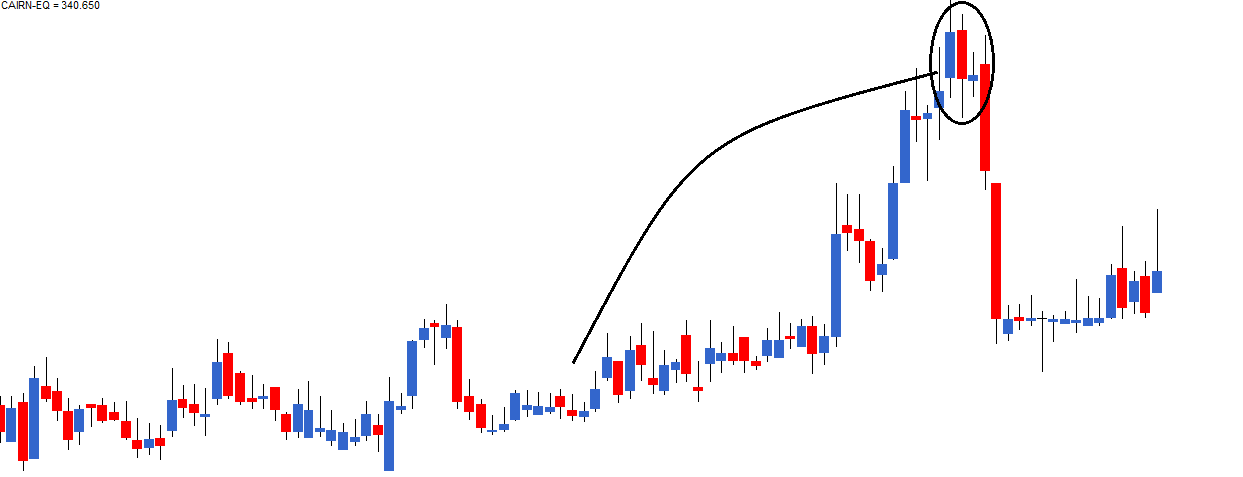
Now here is a very interesting chart. From my own personal experience I can tell you, charts like the one shown below are highly profitable. One should not miss such trading opportunities
Take a look at the chart, what are the things that catch your attention?
- An obvious uptrend as highlighted
- A bearish engulfing pattern right at the top end of the upward rally
- A doji formation on the day following P2
What implication would a doji have in this chart?

Let us inspect this chart event by event:
- A prolonged uptrend in the chart confirms the bulls are in absolute control
- On P1 a blue candle is formed, reconfirming the bull’s dominance in the markets
- On P2 markets open higher and make a new high comforting the bulls. However at the high point a strong surge to sell builds up, to an extent that the prices closes below P1’s opening prices
- This trading action on P2 sets in a bit of panic to bulls, but they are not shaken yet
- On day 3, let us call it as P3, though the opening is weak it is not much lower compared to P2’s close. This is not too comforting for the bulls, as they expect the markets to be stronger.
- During P3 the market attempts to move higher (Doji’s upper shadow) however the high is not sustained. Even the low is not sustained and eventually the day closes flat forming a Doji. As you may recall, Dojis indicate indecision in the market
- On P2 bulls panicked and on P3 bulls were uncertain
- Panic with uncertainty is the perfect recipe for a catastrophe. Which explains the long red candle following the Doji
From my own personal trading experience I can tell you that whenever a doji follows a recognizable candlestick pattern, the opportunity created is bigger. Besides illustrating this point, I also want to draw your attention to chart analysis methodology. Notice in this particular chart, we did not just look at what was happening on P1 or P2 but we went beyond that and actually combined two different patterns to develop a comprehensive view on the market.


0 Comments